Designed for Engagement
Background
Local government entities within California are required to periodically align plans across programs and entities.
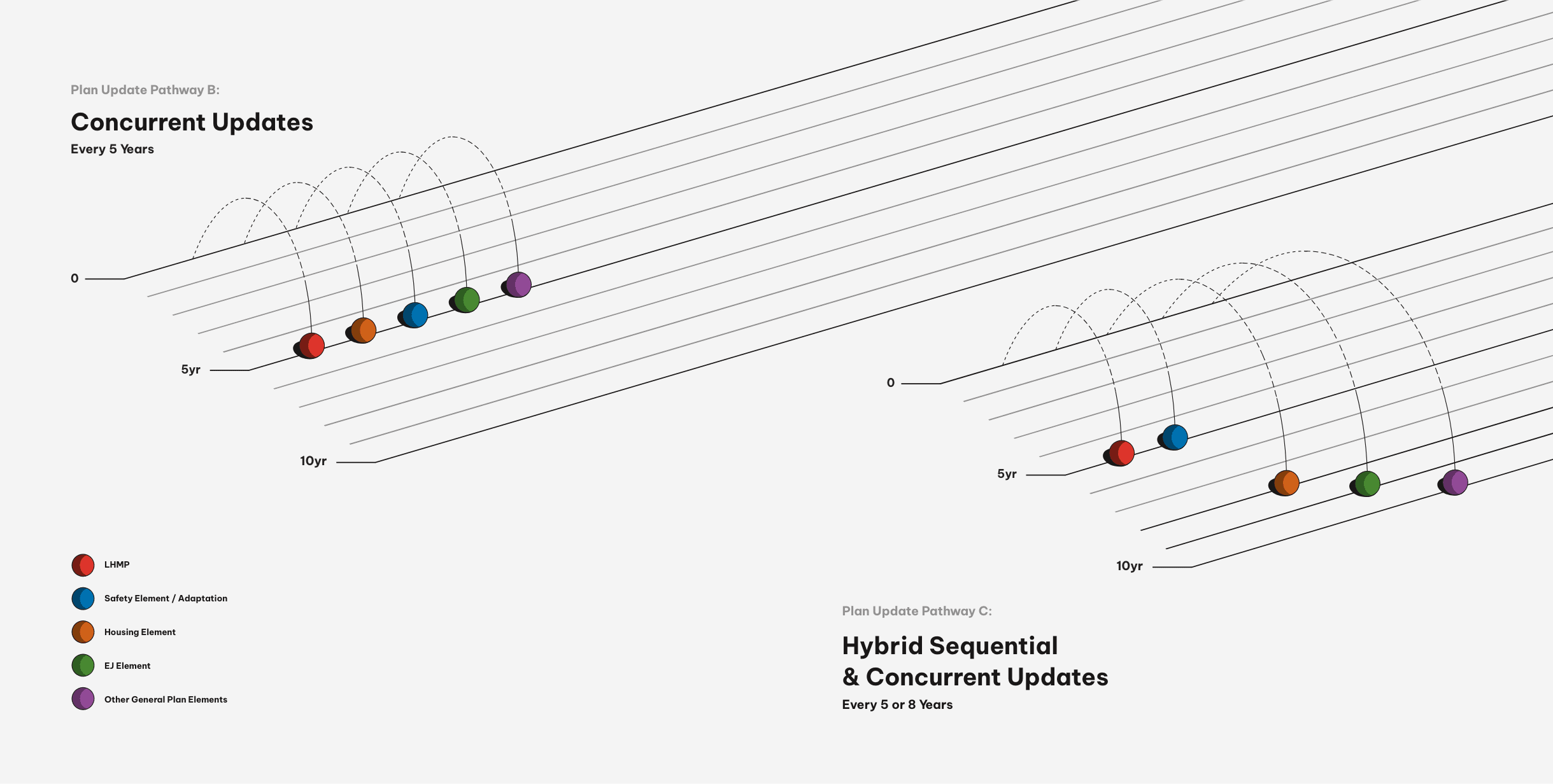
For instance, the General Plan for a region may be updated every five years, while a Local Hazard Mitigation Plan (LHMP) may only be modified every eight years. Gaps in timing can impact plan compatibility.
Community wellbeing depends on various regional plans working together effectively and adhering to all applicable regulations. Many of these regulations address unprecedented hazards stemming from global climate change that local governments must contend with.
One example of an alignment challenge is that the city of Natomas is located in a 100-year floodplain. Theoretically, a possible flood mitigation solution could be requiring all new construction to be elevated on stilts with no habitable, ground-floor space. However, existing ordinances state that no structures may be built on stilts for aesthetic reasons. The two regulations would oppose each other.
Plan alignment ensures that new rules avoid conflicts with established rules.
Objectives
The Adaptation Clearinghouse works with various agencies, such as regional Air Quality Management Districts, to identify climate change concerns that impact local governments, then publishes comprehensive technical guides to assist with the alignment of climate hazard preparation plans.
Coastal Compass is one such previously published guide. Due to its success, the Adaptation Clearinghouse expanded this program with three additional guides, each related to a different climate hazard:
- Coastal Hazards Resilience (addressing the rise of sea water),
- Wildfire Resilience (addressing unplanned fire mitigation), and
- Flood-After-Fire Resilience (addressing landslides and debris flows).
Voice & Reason was charged with two primary objectives:
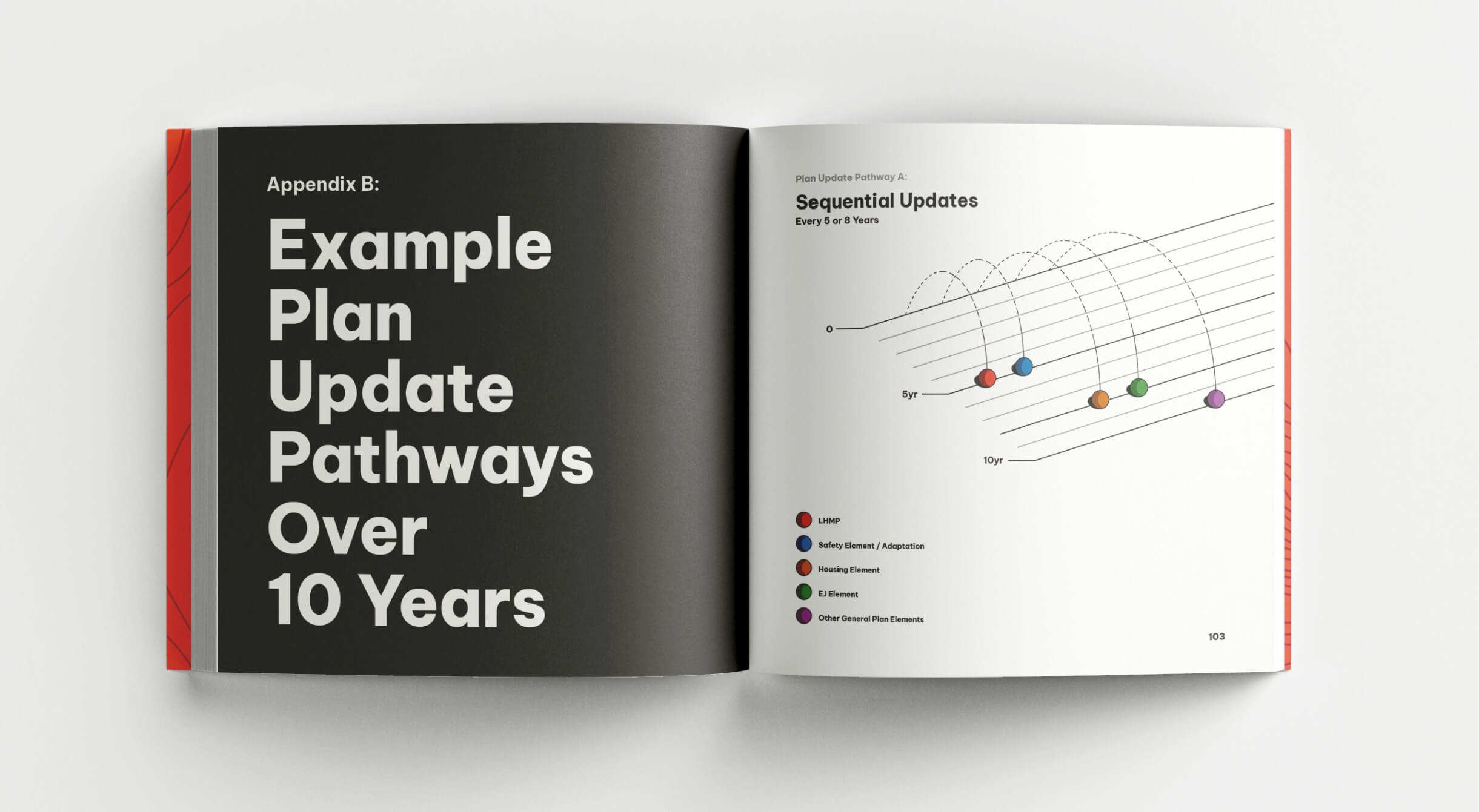
- Create a modular template system for both digital and print production that could accommodate future guide editions. Our goal was to make these complex resources approachable and useful for stakeholders.
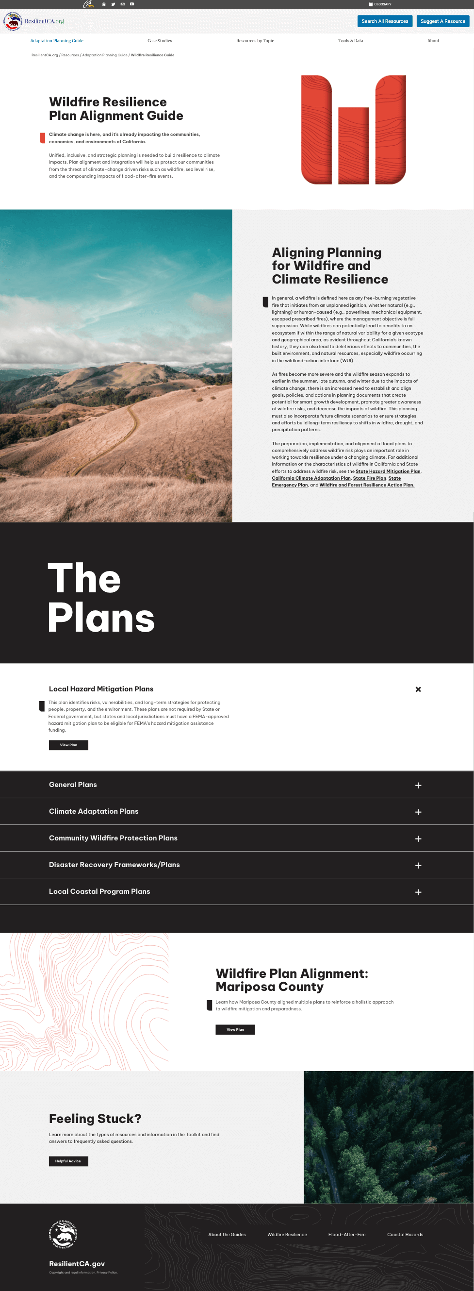
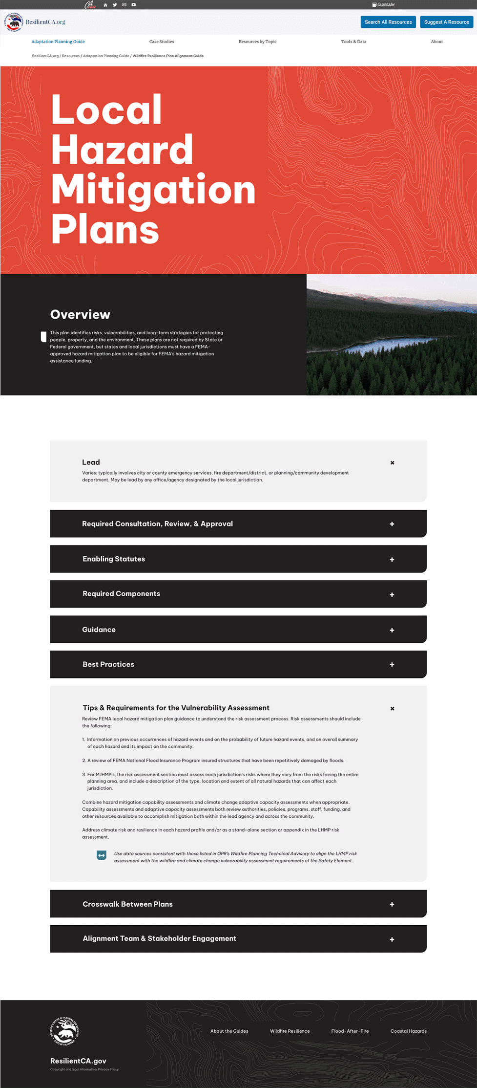
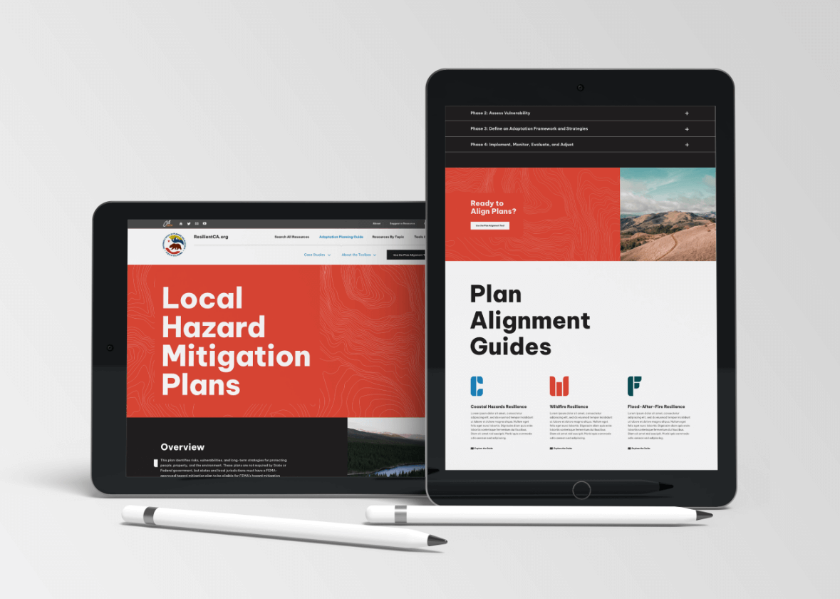
- Design a website that maximizes stakeholder engagement with content, including determining optimal visual presentation, functionality, and organization of information. Development was performed by an existing third-party agency.
Coastal Hazards Resilience is currently in progress, and more guides are anticipated in the coming year.
Solutions
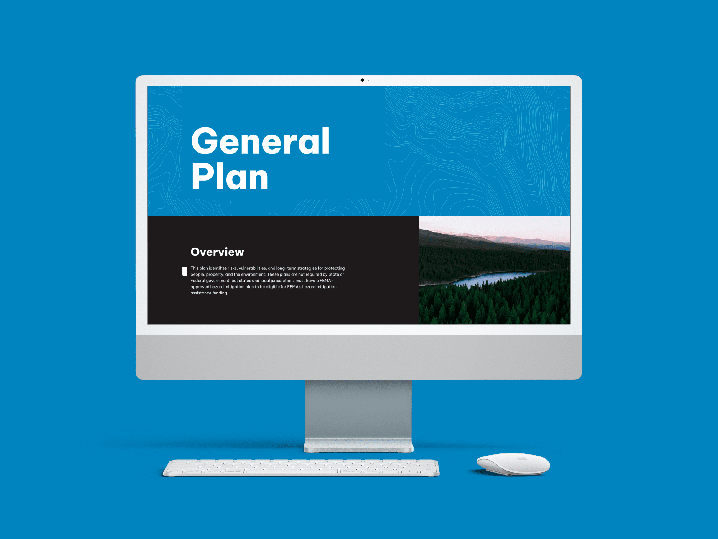
- Strikingly crisp visual theme invites the user to navigate and digest information quickly.
- Bold application of simple letterforms in a coordinated color series unify the individual guides.
- Subtle topography lines add relevancy and texture without adding clutter.
- Letterforms are punched out on print versions, allowing abstract topographic visuals to peek through for visual interest.
- Carefully selected photography depicts the intersection of built communities with wildlands.
- Deconstructed, redesigned technical diagrams present information in a clear, compelling, and visually consistent manner throughout the guides.
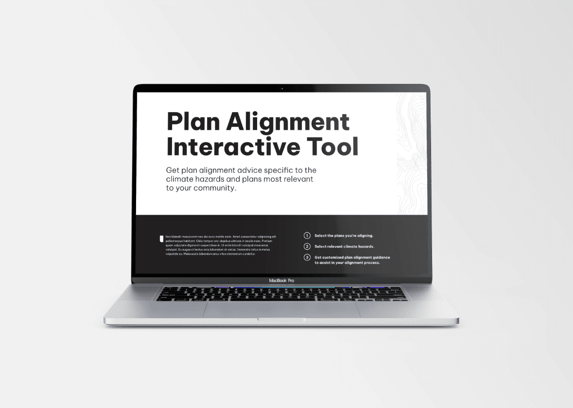
- Custom website architecture provides a retail-inspired experience where users select plans and hazards relevant to their specific needs, then receive customized results that include only the alignment guidance pertaining to their unique situation.
Outcomes
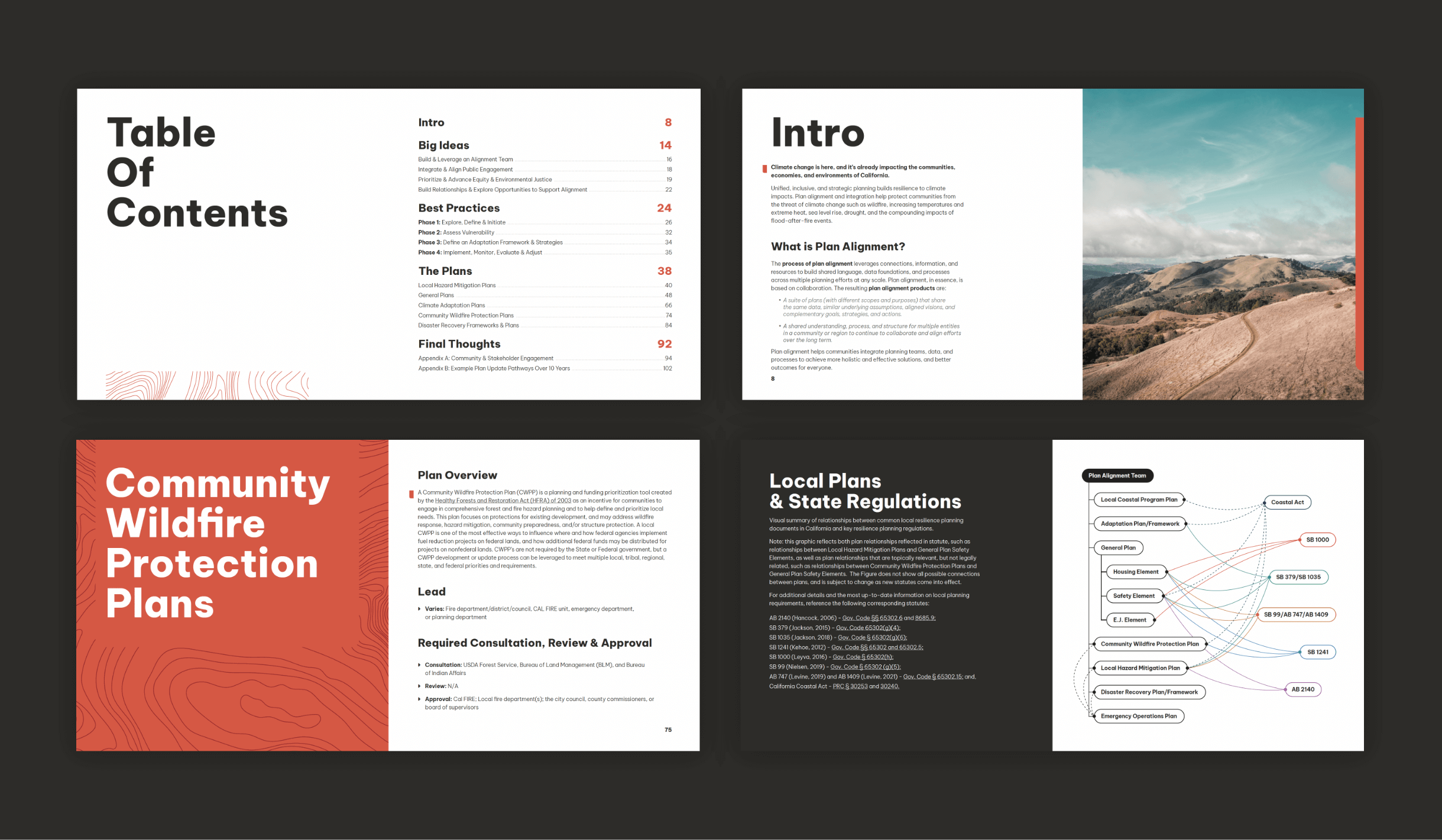
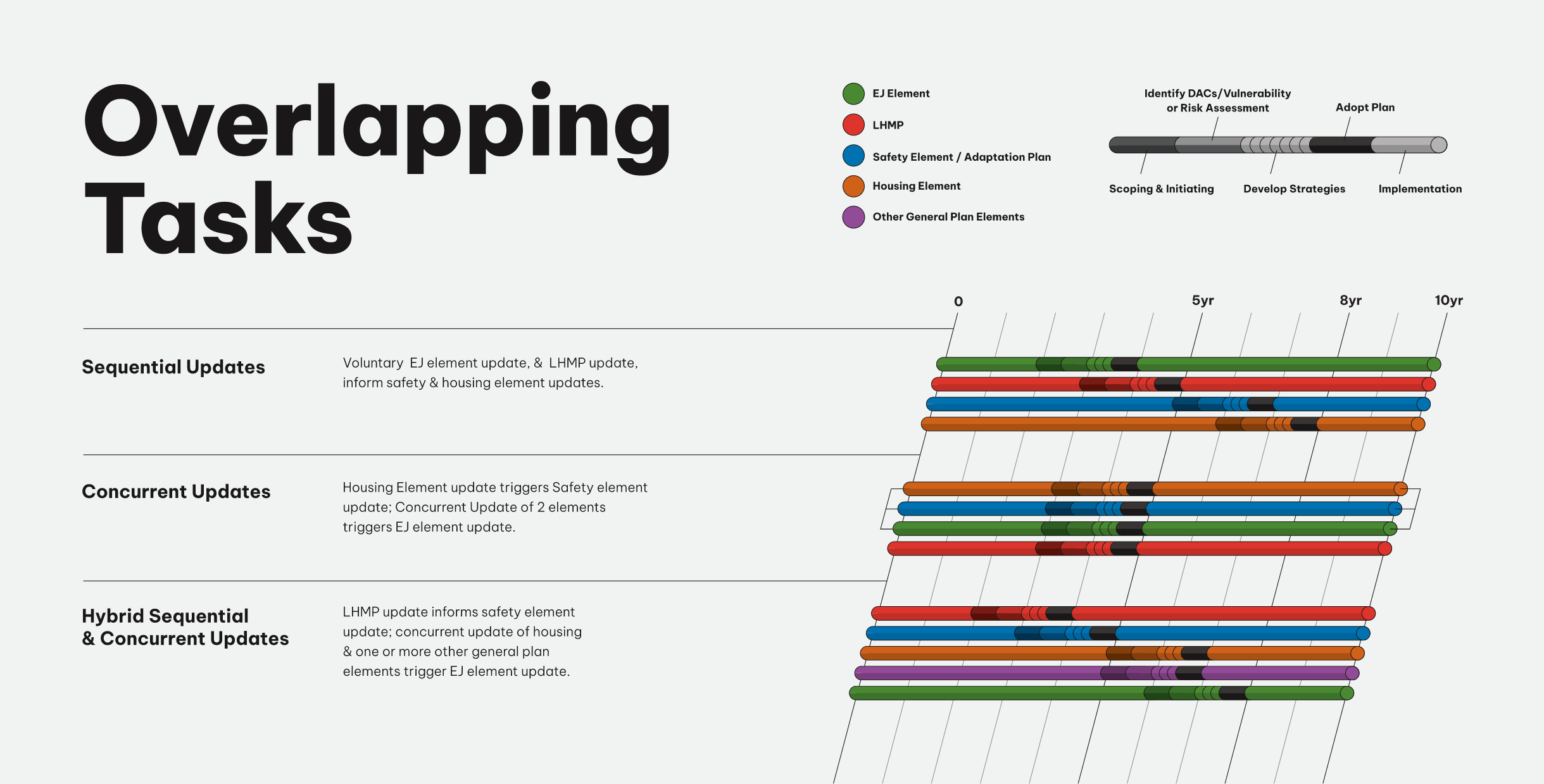
Some of the work shown includes creative options developed by Voice & Reason but not selected for use by the client.

