Fast Track to Industry Impact
CLAD, a newly formed engineering services company, accepted a last-minute industry event sponsorship opportunity, but they only had an “under construction” digital announcement to represent their business. Voice & Reason orchestrated a robust, custom website in less than one month.
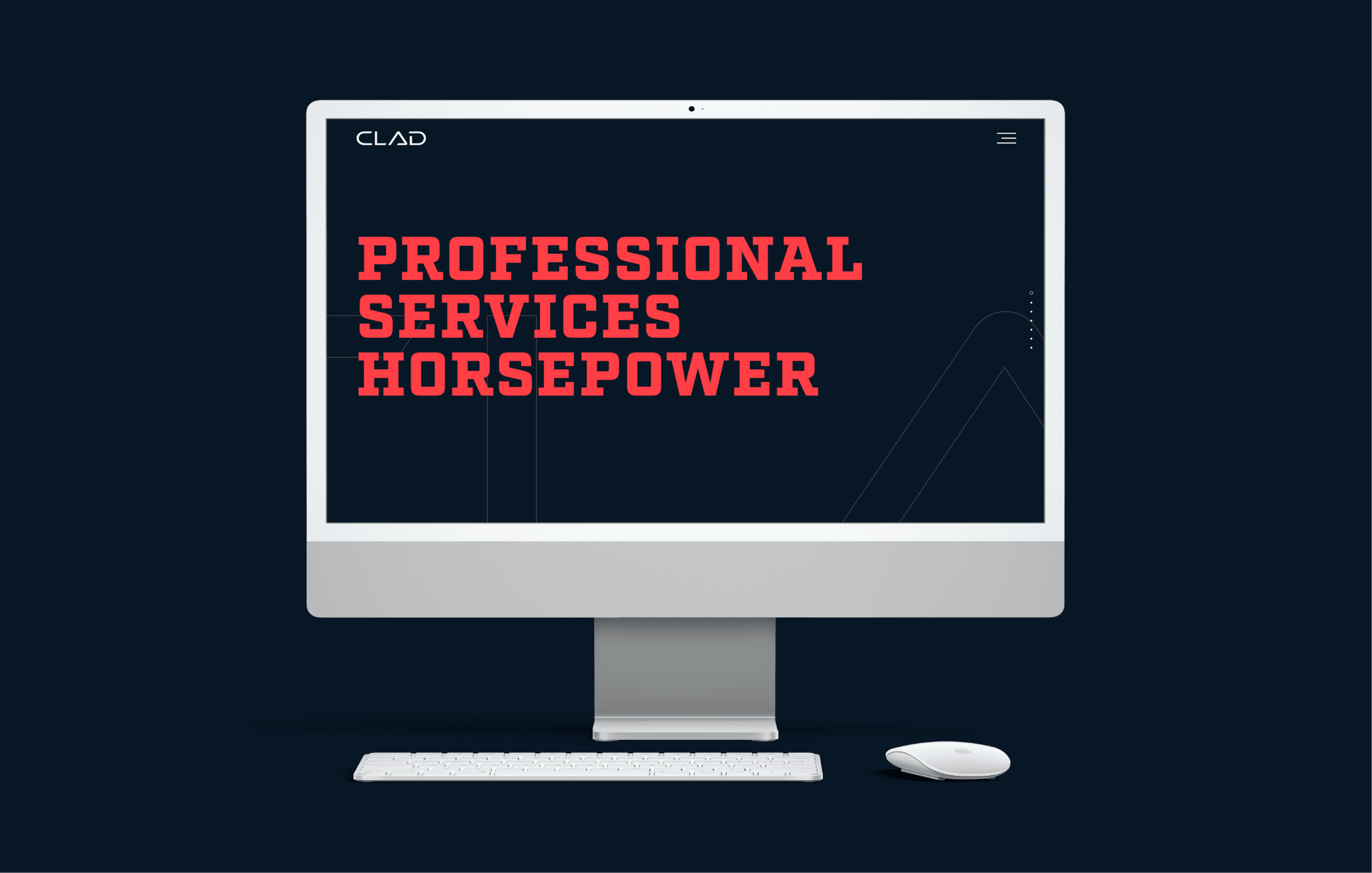
CLAD website displayed on desktop screen

Background

The CLAD Group envisioned a powerful debut that reflected the founders’ formidable, combined decades of industry experience. The company had been open less than a year with exponential growth supported by an innovative, agile business model. Ready to launch a new service offering to their mix, CLAD wanted to take advantage of participating in the CMAA Western Winder Workshop, a well-attended construction management conference.

There was one monumental challenge: The event was just over three weeks away. CLAD still lacked a website, business cards, and other basics that represent organizational viability. Custom website development is a methodical, detailed process that normally takes several months to complete. Thanks to our in-house team, Voice & Reason had the leverage and resources to turn CLAD’s concept into reality at break-neck speed.

Objectives

CLAD was looking for a website that delivers a bold statement through dynamic visual impact and strategic, straightforward content. The website needed to communicate stability and expertise, appeal to decisions-makers in the construction industry, and capture leads seamlessly. Primary objectives included:

  • Establish a unique brand identity.
  • Communicate industry experience and authority.
  • Invite interaction with potential customers.
  • Deliver an engaging user experience.
  • Capture leads from event participation.

Solutions

Voice & Reason deployed an aggressive project management approach to meet CLAD’s extraordinarily quick deadline. With all of the necessary talent on staff — from strategy and content development to design and web development — we delivered this high-octane, fully custom project on time with creativity, quality, and precision.
Our team refined CLAD’s existing mark to craft a unique, industrial style that stands out assertively in the construction field. We balanced daring serif typography and a compelling color palette with sleek simplicity and understated details. The dark, almost-black shade of teal demonstrates trustworthiness and authority, while the eye-catching, energetic red hue communicates horsepower and fortitude. Lighter teal accents suggest technical expertise and add depth and dynamism.
We incorporated custom features to engage users and invite them to move throughout the website. Innovative navigation combined vertical and horizontal scrolling, highlighted by subtle menu animations and fine texture elements that make the site feel polished.
Website traffic generated by event participation was supported by printed materials with minimalist design and QR-code-driven functionality, including business cards and a digital drawing entry system to win a popular drone.

The dark, almost-black shade of teal demonstrates trustworthiness and authority, while the eye-catching, energetic red hue communicates horsepower and fortitude.

Outcomes
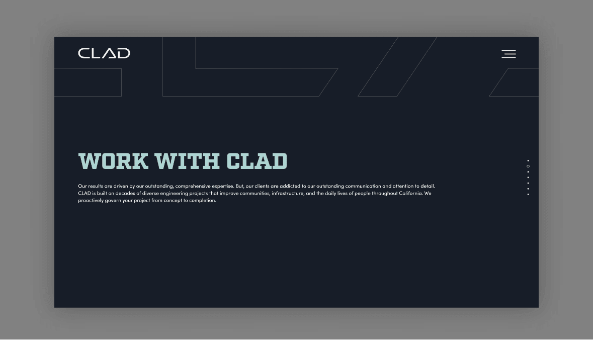
CLAD website screen - work with clad
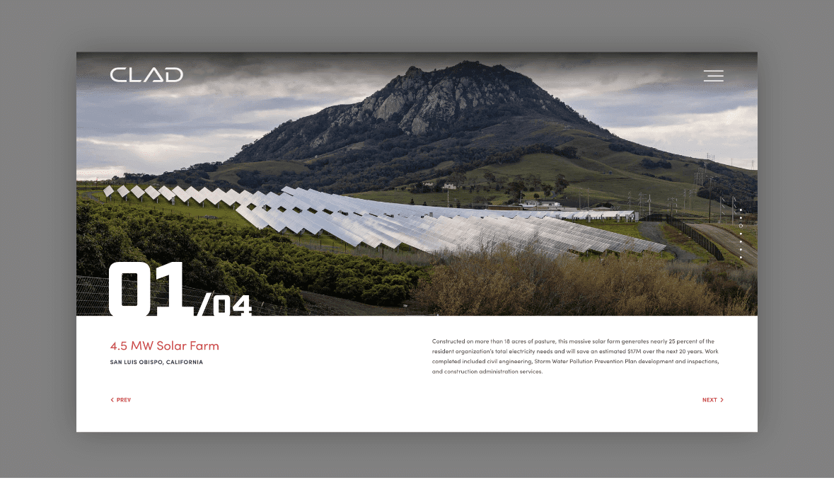
CLAD website screen - project 1
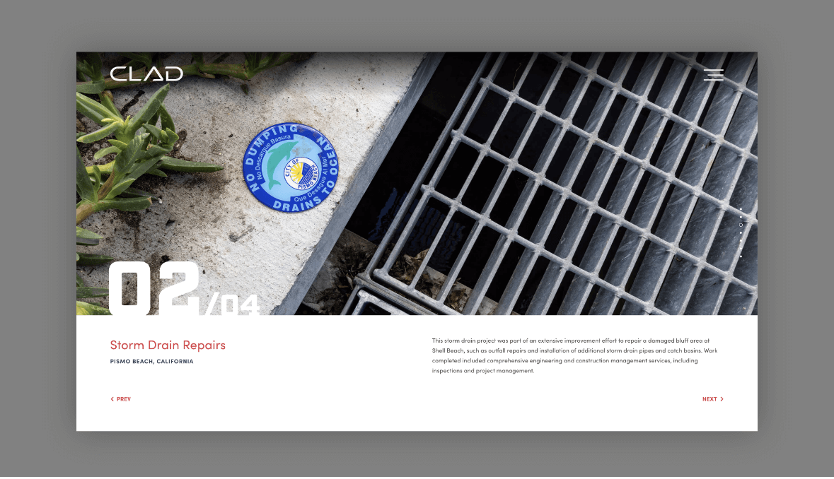
CLAD website screen - project 2
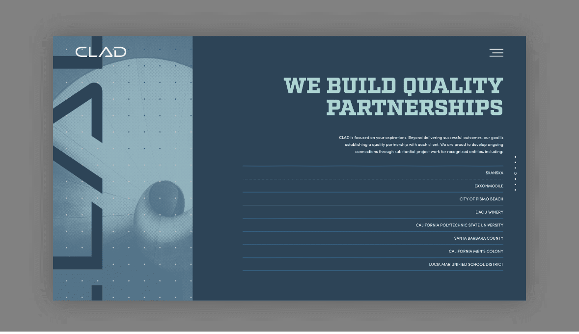
CLAD website screen - partnerships
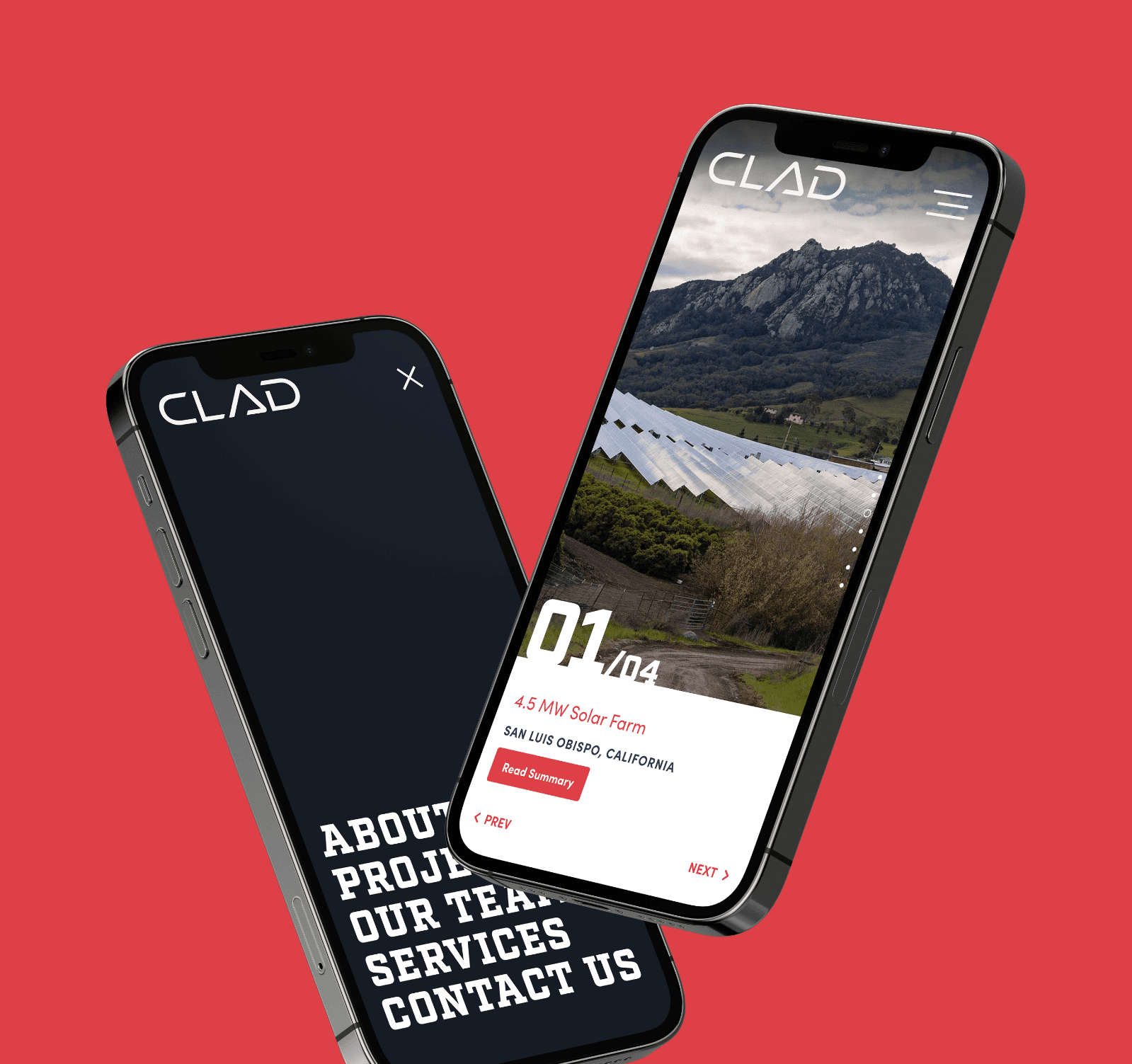
CLAD website displayed on mobile phone
CLAD graphic
CLAD graphic

More In This Category

Charge website on mobile device
Digital Presence|Charge

Built for Efficient Expansion

Nordby Signature Builders website on desktop screen
Digital Presence|Nordby Companies

Modular Information Architecture

Eagle Protect website on mobile
Digital Presence|Eagle Protect

Tailored User Experience

Award badge