Vibrant New Logo for State Agency
Now rebranded as the California Governor’s Office of Land Use and Climate Innovation (LCI), formerly the Governor’s Office of Planning and Research (OPR), the vibrant new logo reflects purposeful intersections of community living, natural resources, agriculture, and climate.
The Governor’s Office of Planning and Research (OPR) was originally established by statute in 1970 to serve as the state’s comprehensive planning agency advising the Governor and Cabinet on land use, community development, and climate change mitigation strategies. In 2023, the agency underwent a strategic reorganization for improved clarity, efficacy, and utilization of state resources to better serve the needs of its constituents. Cal. Gov. Code § 65037 Section 65037 then established the Governor’s Office of Land Use and Climate Innovation, replacing the OPR name. The agency’s new logo supports this name and organizational structure update.
Voice & Reason guided OPR through a comprehensive, 18-month process that began with facilitated input sessions to uncover and document audience opinions of the agency’s branches, services, and programs. Insights were used to inform name development, resulting in a name that re-centers the agency closer to the original statute under which it was formed, while reflecting evolved agency functions. Leaders within the agency prioritized more closely aligning with the Governor’s priorities with clarity of purpose bridging gubernatorial administrations.
As with updating the agency’s organizational structure and name, the development of the new logo involved a collaborative, informed, methodical process that considered the many stakeholders, audiences, and partners that the Governor’s Office of Land Use and Climate Innovation interacts with and impacts.
The new logo design brings together purposeful intersections of community living, natural resources, agriculture, and climate. Each component mindfully represents key agency characteristics, gracefully crafted into a meaningful, modern, aesthetically pleasing and memorable mark. The star element, inspired by both the original OPR logo and the California state flag, symbolizes a continuity of vision and partnership across state agencies and acts as a focal element for visual balance. Design options ranged from a prominent red hue to more subdued colors and shapes.


Hand-drawn logo sketches reveal a collaborative and methodical design process, thoughtfully shaped by input from stakeholders, audiences, and partners.

The bold, versatile mark was thoughtfully designed for dynamic and diverse applications—from signage to swag—maintaining clarity and impact across practical uses.
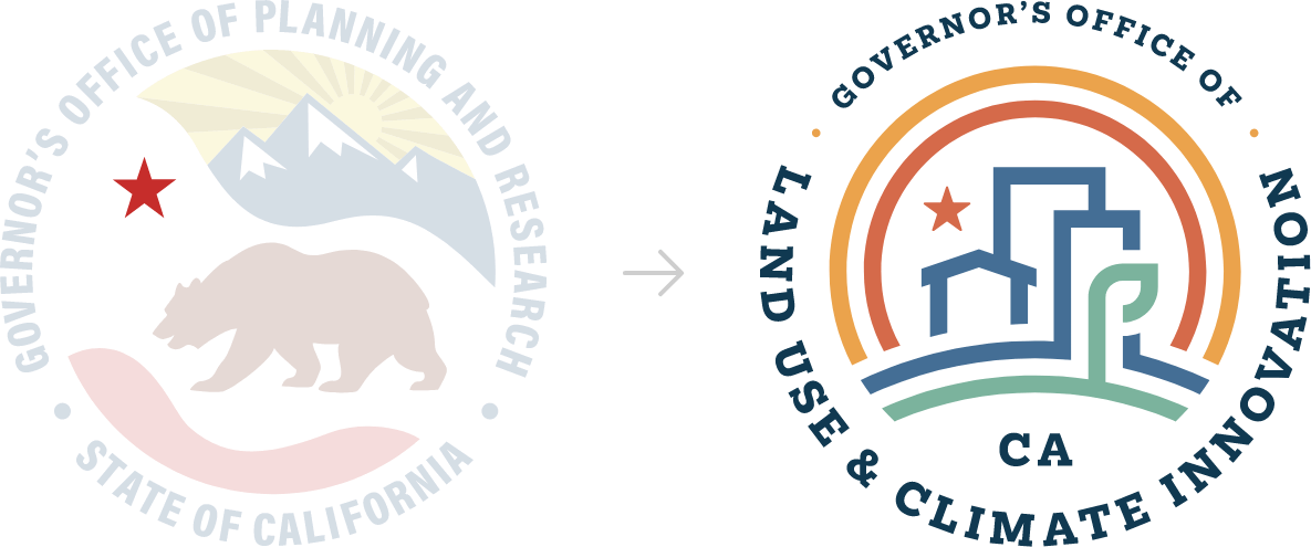
The star element, inspired by both the existing OPR logo and the California state flag, is a focal element within the mark used to visually balance the agricultural element in the lower right.
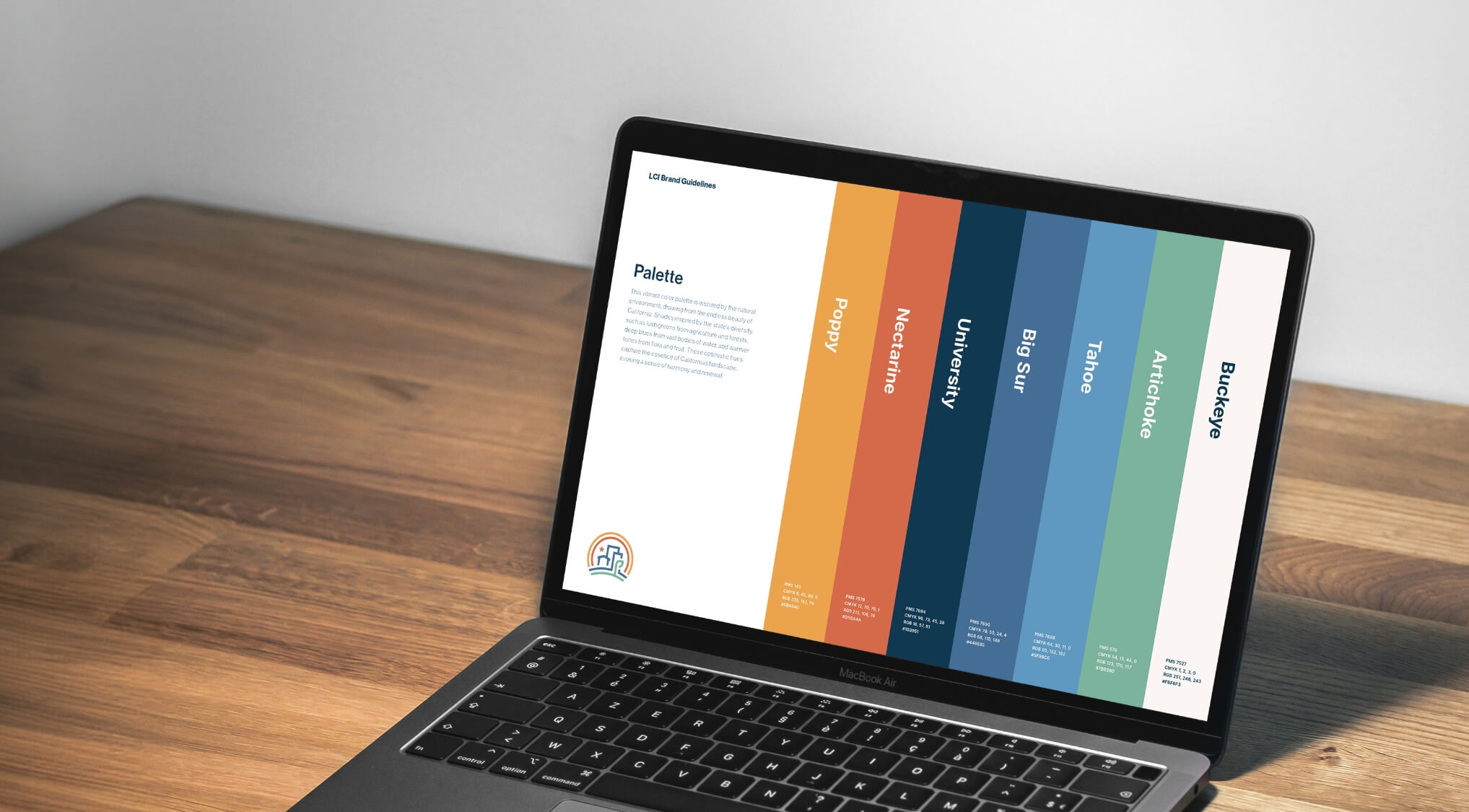
A vibrant color palette inspired by California’s natural beauty, with lush greens from agriculture and forests, deep blues from the ocean, and warm tones from flora and fruit. These optimistic hues capture the state’s diverse landscape, evoking harmony and renewal.


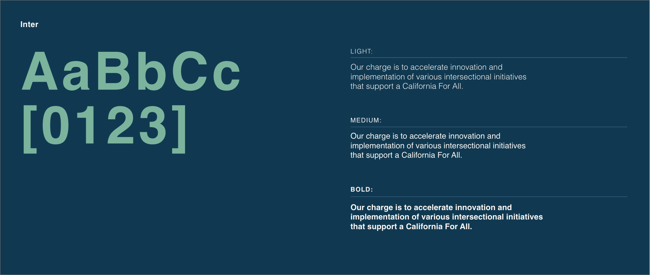
Carefully selected typography balances professionalism, readability, and visual harmony with the logo, along with an approachable, people-forward aesthetic that enhances the brand’s welcoming and modern identity.


